The DMN's Cheryl Hall (last cited in this post) profiles yet another fascinating niche business--this one the video division of a local architecture firm.
Bob Morris, managing principal of Corgan Associates Inc., will tell you that business opportunities crop up in unexpected places.
Two years ago, he gave a small band of architects free rein to expand the firm's computerized media capabilities and drum up outside work.
They'd become proficient at animated 3-D videos of buildings "blossoming" from the ground up and virtual walking tours of interior spaces. And they could create digitized images of cars, gardens, furniture and buildings that were indistinguishable from actual photographs.
Mr. Morris figured other architectural firms might want to outsource their video production.
He was right.
But he had no idea that there was a lucrative market beyond that. He proudly admits his staff had more vision than he did.
This year, Corgan Media Lab, as the 12-person unit is called, will bring in just under $1 million in outside revenue. The bulk of that will be generated by game, feature film and in-store broadcast work.
"These young mavericks had the desire and passion to push an emerging technology into tools that we and other businesses can use," says the 52-year-old Mr. Morris. "They've turned a marketing and R&D cost into a profit center."
His team re-created European historic landmarks as backgrounds for a recently released video game and is offering its digital lighting expertise in an upcoming animated movie.
Images of Old English cottages and homey fireplace-lit interiors fill a corkboard wall of a workroom. These "oil paintings" are for an undisclosed software product being released for Christmas.
The division, reports Hall, not only adds to the firm's profits but helps attract and retain talent. It's a great example of leveraging existing capabilities to expand business potential.
Posted by Virginia Postrel on July 02, 2006 • Comments
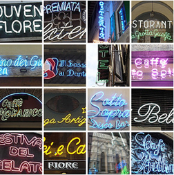
 Inspired by the research for my next Atlantic column, I became fascinated by the many neon signs in and around Florence, most of them for small shops. I've created a Flikr album of some of my favorites.
Posted by Virginia Postrel on July 02, 2006 • Comments

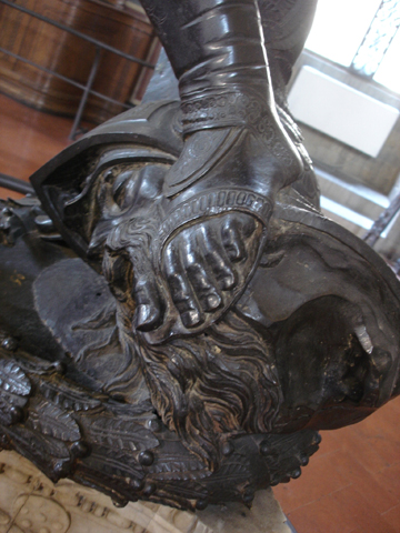
Plenty of museum shops will sell you a photo of Donatello's David, but none of those pictures will give you a good look at his prehensile toes.
Posted by Virginia Postrel on July 02, 2006 • Comments
Reader Julian Becker calls my attention to this article by Chicago Tribune architecture critic Blair Kamen. McDonald's, it seems, has discovered, in Kamin's words, that "There is substance in style and if you want to sell a hamburger and fries, you had better take note." The new McDonald's design isn't just prettier and more up-to-date. It also encompasses more variety.
What they've done inside the new and refurbished buildings is better, recognizing, as the year-old flagship McDonald's along Ontario Street in Chicago does, that people come to McDonald's in different-size groups and with different expectations for their experience. So there are three kinds of seating areas: a "fast" zone, with a large communal table or smaller adjoining tables with stool seats; a "social" zone, where families and others can park in banquettes around big tables; and a more secluded "linger" zone with comfy, upholstered chairs.
This is real customization and it comes with real comfort (the banquettes are outfitted with imitation leather seats and backs versus the "measured comfort" of the double-mansard era, with its cushioned backs and plastic seats). There's also real choice (you actually can move some of the chairs around, unlike the old fixed ones that made you feel like you were eating in the high school gym).
For all the talk about "de-plasticizing" McDonald's, there is still plenty of plastic present in the faux wood tabletops, floors and walls, all of which can be easily cleaned. But the design cleverly de-emphasizes plastic, drawing the eye instead to warm brick walls, soft pendant lights (which replace the harsh lights inserted in acoustical tile) or the plasma TVs that indulge the modern habit of multitasked eating.
With this and other smart touches -- like the red Eames chair and a modern fireplace that adorn the linger zone in the new McDonald's in Westerville -- the result is attractive without being snooty, more a restaurant and less of a pit stop, responding to the rising expectations that people today bring to shopping and eating.
Alas, the Tribune site includes no photos of the new McDonald's.
Posted by Virginia Postrel on July 02, 2006 • Comments
To read some contemporary commentators (Sally Satel reviews one here), you'd think nobody ever considered depression a disease before evil pharmaceutical companies invented Prozac. To the contrary, here's Adam Smith in The Theory of Moral Sentiments on the subject:
Nature, in her sound and healthful state, seems never to prompt us to suicide. There is, indeed, a species of melancholy (a disease to which human nature, among its other calamities, is unhappily subject) which seems to be accompanied with, what one may call, an irresistible appetite for self-destruction. In circumstances often of the highest external prosperity, and sometimes too, in spite even of the most serious and deeply impressed sentiments of religion, this disease has frequently been known to drive its wretched victims to this fatal extremity. The unfortunate persons who perish in this miserable manner, are the proper objects, not of censure, but of commiseration. To attempt to punish them, when they are beyond the reach of all human punishment, is not more absurd than it is unjust.
I'm reading most of Smith's collected works in preparation for a week-long Liberty Fund seminar, affectionately known as Adam Smith Camp. For searchable, nicely formatted, full-text versions of works by Smith and other classic writers, see Liberty Fund's terrific Library of Economics and Liberty. The Econlib site also features Arnold Kling and Bryan Caplan's blog and other contemporary writings.
Posted by Virginia Postrel on July 02, 2006 • Comments

