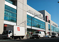
BETTER-LOOKING BOXES

Like Wal-Mart, Home Depot wants to go into urban markets and, like Wal-Mart, it's finding that urbanites have higher aesthetic expectations--in this case, not just for the stores' exteriors but for inside as well. Here's an account from Engineering News-Record.
These stores don't fit into Home Depot's typical format. Inner-city logic dictates a smaller store than the usual 150,000-sq-ft concrete box, as well as a more aesthetic interior, free from the cracked, dusty floors and low-level lighting of some older stores.
Ironically, many of the rough-looking warehouse features of older Home Depot properties were part of the company's original marketing objective. In earlier years, Home Depot lured do-it-yourselfers and small contractors by making them feel as if they were in a warehouse serving "professional contractors." In reality, professionals only make up about one-third of total sales, although the company says it is trying to attract more with special services.
The gimmick paid off in billions, but one competitor, Lowe's, Wilkesboro, N.C., is closing in with annual revenue of $26.5 billion and shoppers are flocking to buildings that are navigable, organized and well-maintained. "The customers today aren't looking for skidmarks and sawdust anymore, they're looking for a bright, clean store," says [Rich] Marshall [Home Depot's vice president of construction].
Over time, I expect the better-looking stores to spread beyond the cities to revamped suburban "big boxes."