Health Care Aesthetics
My latest Atlantic column was actually proposed long before my cancer diagnosis, inspired in part by this old blog post. But I took advantage of my personal experience in writing it.
I'm sitting in a mauve vinyl recliner facing a mauve laminate counter and cabinets. On the countertop are a couple of candy jars, five peacock feathers leaning around a black wall phone, a small plant that may or may not be real, three boxes of medical-exam gloves, and a radio tuned to smooth jazz. A curling five-by-seven-inch photo of the participants in a 2000 fund-raising walk hangs below a sign warning guests not to use cell phones. Someone has pinned three teddy bears to a small strip of cork on the grayish-white wall. "I'm gonna be Okay," says the slogan on the orange bear's chest. The yellow bear wears a blue scrub outfit with an 800 number and the slogan for a cancer organization. On the white bear, hot-pink embroidery declares, "Cancer sucks."
Thank God for intravenous Benadryl, which knocks me out in just a few minutes. The cancer treatment is state-of-the-art, but the decor is decidedly behind the times.
Over the past decade, most public places have gotten noticeably better looking. We've gone from a world in which Starbucks set a cutting-edge standard for mass-market design to a world in which Starbucks establishes the bare minimum. If your establishment can't come up with an original look, customers expect at least some sleek wood fixtures, nicely upholstered chairs, and faux–Murano glass pendant lights.
Unless, that is, your establishment is a doctor's office, medical clinic, or hospital. Mounting clinical evidence suggests that better design can improve patients' health—not to mention their morale. But the one-sixth of the American economy devoted to health care hasn't kept up with the rest of the economy's aesthetic imperative, leaving patients to wonder, as a diabetes blogger puts it, "why hospital clinic interiors have to feel so much like a Motel 6 from the '70s."
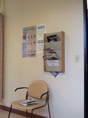
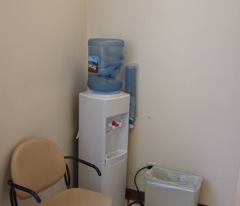
Read the whole thing here. Thanks to all the readers who sent in thoughts about health care design in response to my earlier post. Here are a couple of photos of the imaging waiting room mentioned later in the article. Lovely, huh?


And, from the latest issue of Healthcare Design magazine, here's an article about how a simple (non-aesthetic) design improvement can substantially improve patient well-being.